EDA 팀 프로젝트 수행 후기 및 느낀점
해당 글에서는 EDA 팀 프로젝트 수행 후기 및 느낀점에 대해 소개합니다.

EDA 팀 프로젝트 수행 후기 및 느낀점
🗓️ 2024.04.29 ~ 2024.05.14
약 2주간 진행된 Python EDA 팀 프로젝트를 수행하고 나서의 후기를 작성해보려고 한다. 이번 프로젝트는 데이터 분석에서 필요한 numpy, pandas, Matplotlib, seaborn 라이브러리에 대해서 크게 다루었다. 또 CSV파일 데이터를 활용하여 EDA를 진행하고 데이터 분석을 통한 인사이트를 얻는 시간이 되었다. 우선 EDA(Exploratory Data Analysis)는 데이터를 분석하기 위한 첫 번째 단계로 데이터를 분석하면서 데이터의 특성을 파악하고, 데이터의 분포를 확인하고, 데이터의 결측치를 확인하고, 데이터의 이상치를 확인하는 등의 과정을 통해 데이터를 분석하는 것을 말한다.
데이터 셋 선택
이번 프로젝트에서는 E-commerce 도메인을 중심으로 Kaggle에서 제공하는 데이터셋를 선택하여 EDA를 진행하였다. 데이터셋은 Brazilian E-Commerce Public Dataset by Olist 데이터셋으로, 9개의 데이터셋으로 구성되어 있어 데이터셋 간의 관계를 파악하고 분석하는 것이 주요 목표였다. 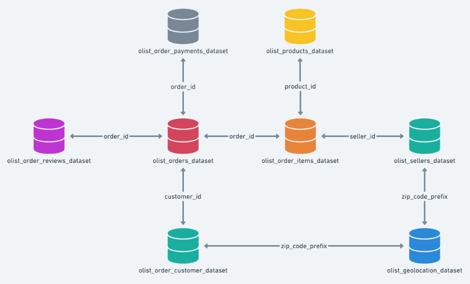
EDA 진행
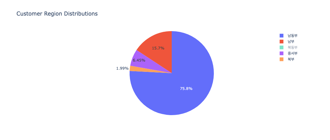
지역별 고객 분포
1
customer_region_data = olist_data.groupby('customer_region').size()
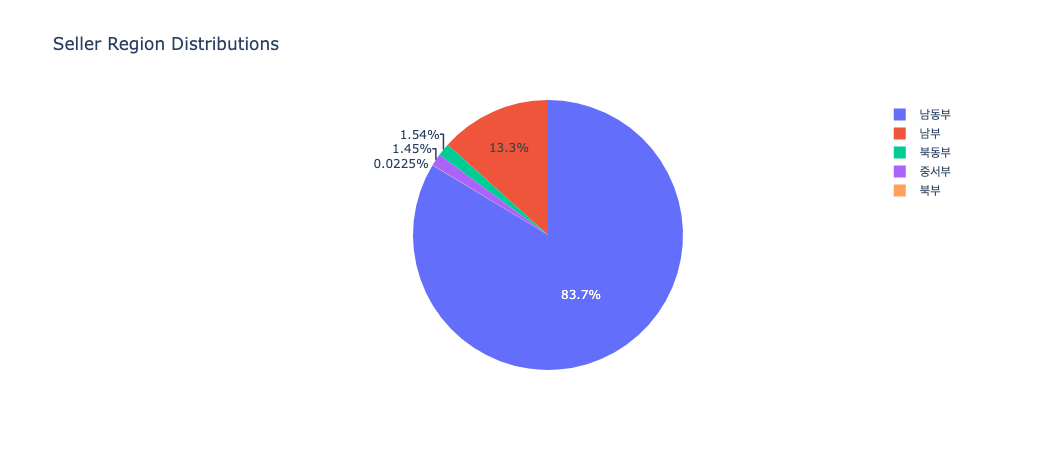
지역별 판매자 분포
1
seller_region_data = olist_data.groupby('seller_region').size()
지역별 매출액
1
2
3
fig= px.bar(olist_data, x='customer_region', y='total_price', title='Total Sales by Region')
fig.update_traces(marker_color='rgb(158,202,225)', marker_line_color='rgb(8,48,107)', marker_line_width=1.5, opacity=0.6)
fig.show()

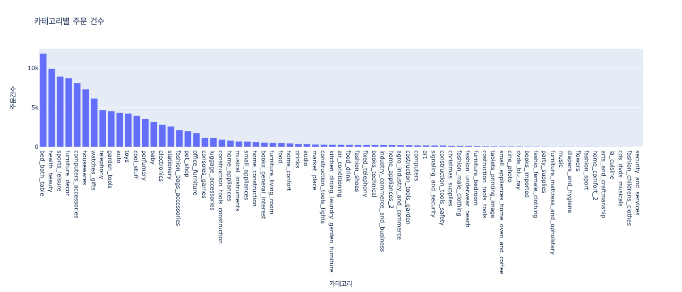
카테고리별 주문건수
1
2
3
4
5
6
7
8
9
10
11
category_df = pd.DataFrame(olist_data['product_category_name_english'].value_counts())
category_df = category_df.reset_index()
category_df.columns = ['카테고리', '주문건수']

fig = px.bar(category_df, x='카테고리', y='주문건수', title='카테고리별 주문 건수')
fig.update_layout(
    autosize=False,
    width=1400,
    height=600,
)
fig.show()
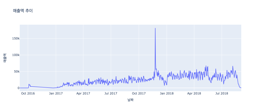
매출액 추이
1
2
3
4
5
6
7
# order_purchase_timestamp 컬럼을 활용하여 연도, 월, 일, 요일, 시간 컬럼 추가
olist_data['order_purchase_timestamp'] = pd.to_datetime(olist_data['order_purchase_timestamp'])
olist_data['purchase_date'] = olist_data['order_purchase_timestamp'].dt.date
olist_data['year'] = olist_data['order_purchase_timestamp'].dt.year
olist_data['month'] = olist_data['order_purchase_timestamp'].dt.month
olist_data['day'] = olist_data['order_purchase_timestamp'].dt.day
olist_data['hour'] = olist_data['order_purchase_timestamp'].dt.strftime('%H:%M:%S')
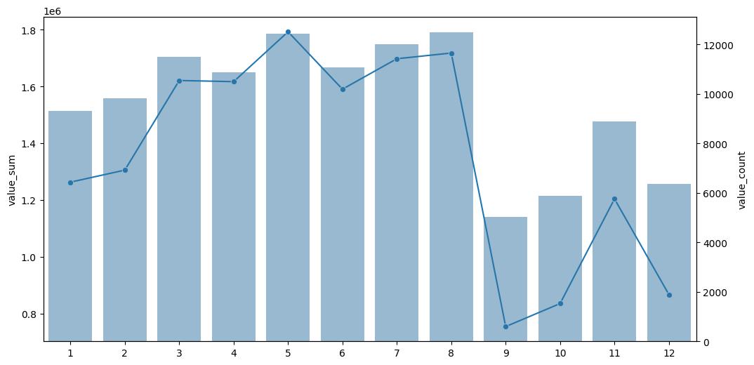
월별 매출액
1
2
3
4
5
6
7
8
9
10
# 월별 매출액의 합계 피벗테이블 생성
month_purchase_pt = pd.pivot_table(data = olist_data,
                                   index = 'month',
                                   values = 'payment_value',
                                   aggfunc = 'sum').reset_index()
# 월별 주문 건수 피벗테이블 생성
month_purchase_pt2 = pd.pivot_table(data = olist_data,
                                  index = 'month',
                                  values = 'payment_value',
                                  aggfunc = 'count').reset_index()
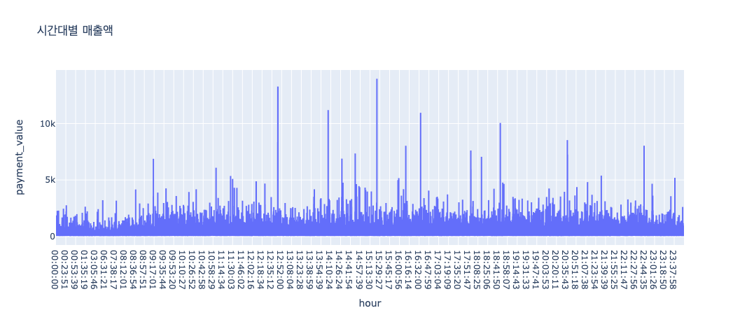
시간대별 매출액
1
2
3
4
5
# 시간대별 매출액
hour_purchase_pt = pd.pivot_table(data = olist_data,
                                  index = 'hour', # 00:00:00 포매팅
                                  values = 'payment_value',
                                  aggfunc = 'sum').reset_index()
folium을 활용한 지도 시각화
1
2
3
4
5
6
7
8
9
10
11
12
13
14
15
16
import folium
from folium.plugins import MarkerCluster

def to_map(data_set, num_samples, popup_column, width=1200, height=800, title: str = "Map"):
    sample_data = data_set.sample(n=num_samples)
    m = folium.Map(location=[-14.235004, -51.92528], zoom_start=4)
    marker_cluster = MarkerCluster().add_to(m)

    for index, row in sample_data.iterrows():
        folium.Marker(
            location=[row['geolocation_lat'], row['geolocation_lng']],
            popup=f"{popup_column}: {row[popup_column]}",
            icon=folium.Icon(color='blue')
        ).add_to(marker_cluster)

    return m
고객 위치 시각화
1
to_map(geo_customer_data, 3000, "customer_id")
판매자 위치 시각화
1
to_map(geo_seller_data, 3000, "seller_id")

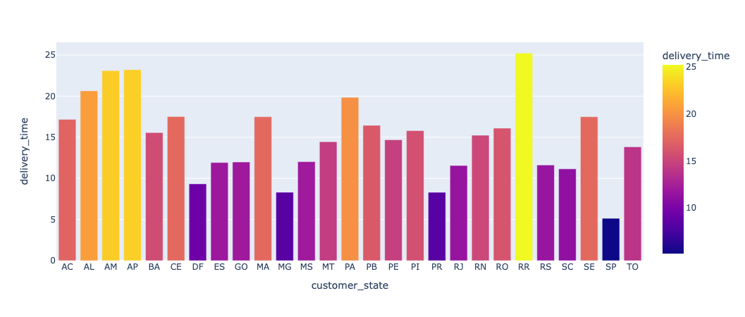
주별 평균 배송비
1
2
3
4
5
6
7
8
# - 고객의 위치에 따른 배송시간(배송일 - 배송시작일)을 계산하여 folium을 이용하여 지도로 표시
geo_customer_order_data['order_delivered_customer_date'] = pd.to_datetime(geo_customer_order_data['order_delivered_customer_date']) # 배송일
geo_customer_order_data['order_delivered_carrier_date'] = pd.to_datetime(geo_customer_order_data['order_delivered_carrier_date']) # 배송시작일
geo_customer_order_data['delivery_time'] = geo_customer_order_data['order_delivered_customer_date'] - geo_customer_order_data['order_delivered_carrier_date'] # 배송시간

# 배송시간을 .day로 변경(소수점 제거)
geo_customer_order_data['delivery_time'] = geo_customer_order_data['delivery_time'].dt.days
geo_customer_order_data
배송 시간별 고객과 판매자 간 평균 거리
1
2
3
4
5
6
7
8
9
10
11
12
13
14
15
16
17
18
19
20
21
22
23
24
25
26
27
28
29
30
31
32
33
34
35
36
37
38
39
40
41
42
43
44
45
# 필요한 모듈 불러오기
import math

# 위도와 경도를 통해 거리(단위 : km)를 계산하는 함수 정의
def haversine_distance(lat1, lon1, lat2, lon2):
    # 지구의 반지름 (평균 반지름은 약 6,371 km)
    R = 6371.0

    # 위도 및 경도를 라디안으로 변환
    lat1 = math.radians(lat1) # 구매자 위도
    lon1 = math.radians(lon1) # 구매자 경도
    lat2 = math.radians(lat2) # 판매자 위도
    lon2 = math.radians(lon2) # 판매자 경도

    # 위도 및 경도의 차이
    dlat = lat2 - lat1
    dlon = lon2 - lon1

    # Haversine 공식을 사용하여 거리 계산
    a = math.sin(dlat/2)**2 + math.cos(lat1) * math.cos(lat2) * math.sin(dlon/2)**2
    c = 2 * math.atan2(math.sqrt(a), math.sqrt(1 - a))
    distance = R * c

    return distance

# 각 행에 대해 거리를 계산하는 함수 정의
def calculate_distance(row):
    lat1 = row['geolocation_lat_customer']  # 구매자 위도
    lon1 = row['geolocation_lng_customer']  # 구매자 경도
    lat2 = row['geolocation_lat_seller']    # 판매자 위도
    lon2 = row['geolocation_lng_seller']    # 판매자 경도

    # haversine_distance 함수를 호출하여 거리 계산
    distance = haversine_distance(lat1, lon1, lat2, lon2)
    return round(distance, 3)  # 소수점 3번째 자리에서 반올림

# 배송시간이 15일 이상 걸린 경우의 데이터프레임 생성
long_delivery_data = olist_data[olist_data['delivery_time'] >= 15]
long_delivery_data['distance'] = long_delivery_data.apply(calculate_distance, axis=1)
long_delivery_mean_distance = round(long_delivery_data['distance'].mean(), 3)

# 배송시간이 15일 미만 걸린 경우의 데이터프레임 생성
short_delivery_data = olist_data[olist_data['delivery_time'] < 15]
short_delivery_data['distance'] = short_delivery_data.apply(calculate_distance, axis=1)
short_delivery_mean_distance = round(short_delivery_data['distance'].mean(), 3)

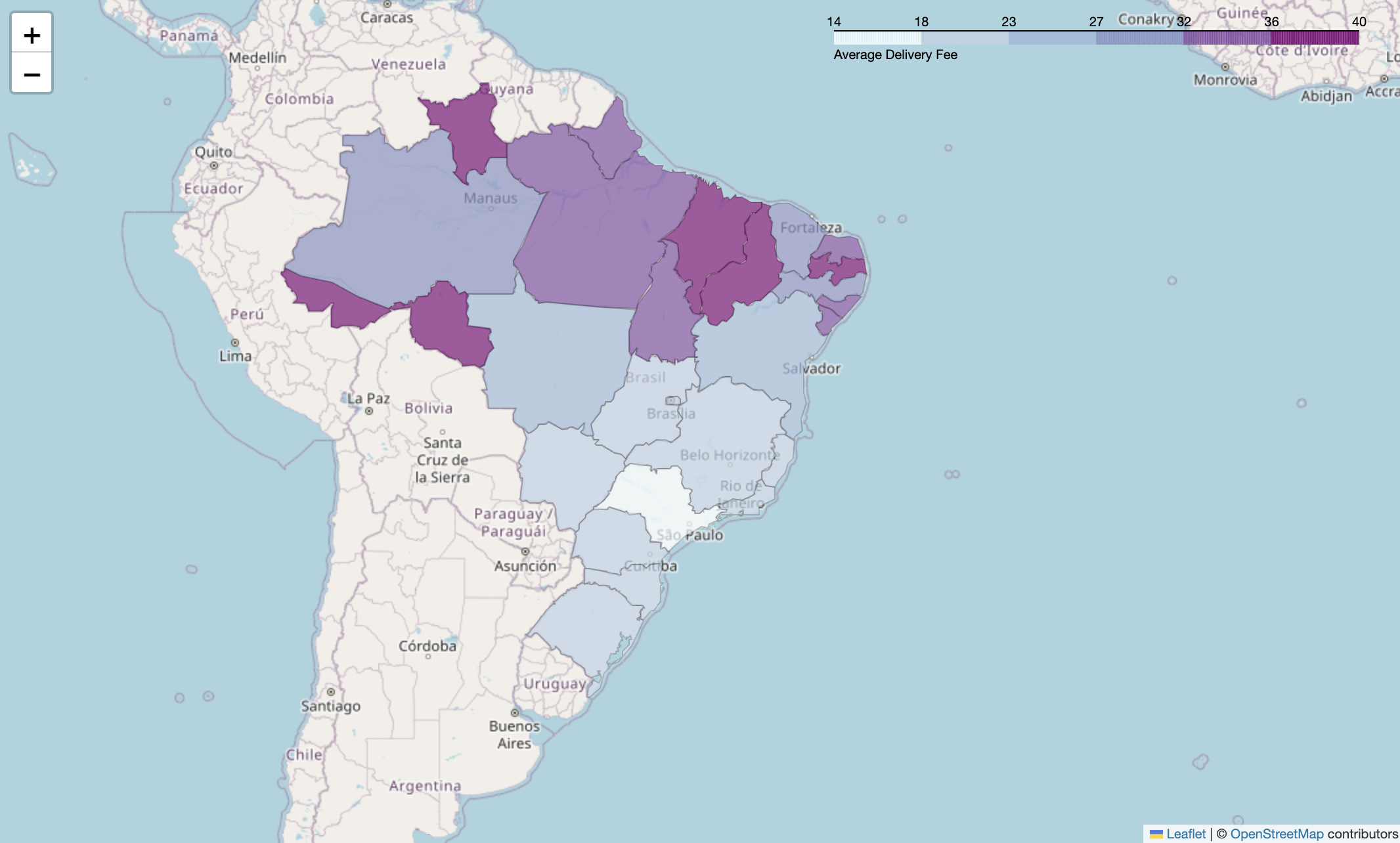
지역별 평균 배송비
1
2
3
4
5
6
7
8
9
10
11
12
13
14
15
16
17
18
19
20
21
22
23
24
25
26
27
28
import folium
import pandas as pd

# olist_data에서 배송비 계산
olist_data['delivery_fee'] = olist_data['freight_value'] / olist_data['order_item_id']

# 배송비가 0보다 큰 데이터만 추출
delivery_fee_data = olist_data[olist_data['delivery_fee'] > 0]

# 지역별 평균 배송비 계산
state_delivery_fee = delivery_fee_data.groupby('customer_state')['delivery_fee'].mean().reset_index()
state_delivery_fee['delivery_fee'] = state_delivery_fee['delivery_fee'].round(2)  # 평균 배송비를 소수점 둘째 자리까지 반올림하여 저장

# 지도 생성
m = folium.Map(location=[-14.235004, -51.92528], zoom_start=4)

# Choropleth 레이어 추가
folium.Choropleth(
    geo_data='geojson',
    name='choropleth',
    data=state_delivery_fee,
    columns=['customer_state', 'delivery_fee'],
    key_on='feature.properties.sigla',
    fill_color='BuPu',
    fill_opacity=0.7,
    line_opacity=0.2,
    legend_name='Average Delivery Fee'
).add_to(m)
인사이트
- 고객과 판매자의 위치에 따른 배송 시간과 거리의 상관관계
- 배송 시간이 15일 이상 걸린 경우의 평균 거리는 1,000km 이상으로, 배송 시간이 길어질수록 거리가 멀어지는 경향이 있다.
- 반면, 배송 시간이 15일 미만 걸린 경우의 평균 거리는 500km 이하로, 배송 시간이 짧을수록 거리가 가까워지는 경향이 있다.
- 배송 시간이 15일 차이가 나면 최소 평균 거리는 500km 이상 차이가 나는 것으로 보아, 배송 시간과 거리는 상관관계가 있다고 볼 수 있다.
- 지역별 평균 배송비
- 지역별 평균 배송비는 상이하며, 평균 배송비가 높은 지역은 SP, RJ, MG 등이다.
- 반면, 평균 배송비가 낮은 지역은 RR, AP, AC 등이다.
- 매출액
- 2017년 10월부터 2018년 8월까지 매출액이 증가하는 추세를 보이다가 2018년 9월부터 2018년 12월까지 매출액이 감소하는 추세를 보인다.
- 시간대별 매출액은 10시부터 16시까지 매출액이 가장 높은 것으로 나타났으며 사람들이 보통 낮 시간대에 많이 구매하는 것으로 보인다.
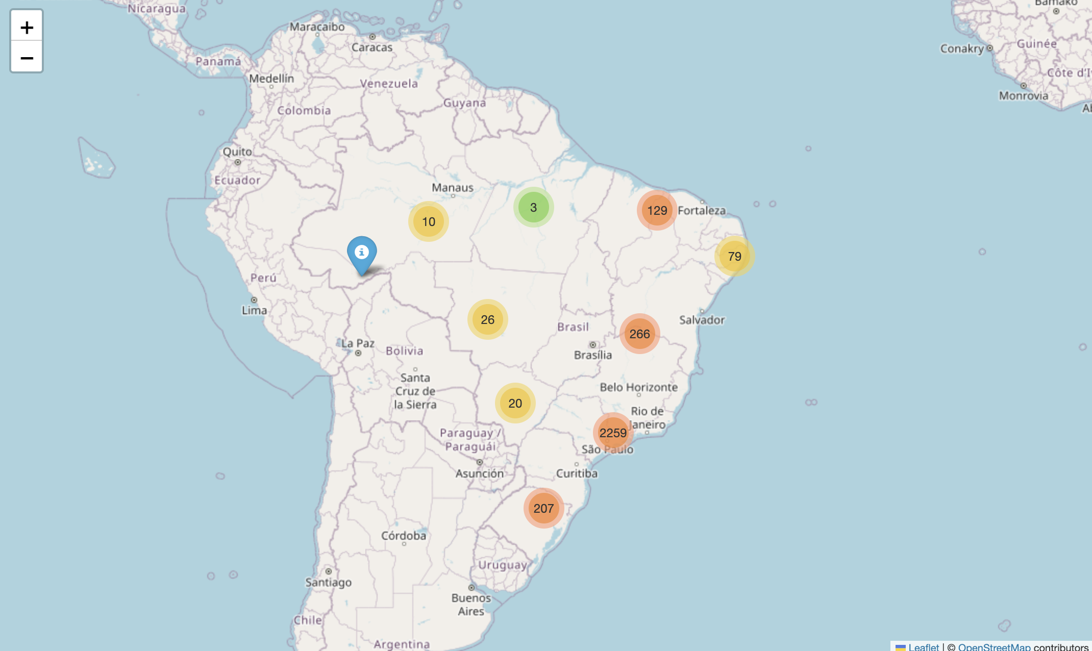
- 고객과 판매자 위치
- 고객과 판매자의 위치를 지도로 시각화한 결과, 고객과 판매자의 위치가 서로 다른 지역에 위치한 경우가 많았다.
- 고객과 판매자의 위치가 서로 다른 경우 배송 시간이 길어지는 경향이 있었다.
- 판매자는 보통 상파울루, 미나스제라이스, 리우데자네이루 등의 지역에 많이 위치해 있었으며, 고객은 상파울루, 리우데자네이루, 미나스제라이스 등의 지역에 많이 위치해 있었다.
- 판매자가 많이 모여 있는 지역은 공항 근처에 위치해 있었으며, 고객이 많이 모여 있는 지역은 시내 중심부에 위치해 있었다.
느낀점
이번 프로젝트를 통해 데이터 분석을 통한 인사이트 도출과 시각화에 대한 중요성을 깨달았다. 데이터를 분석하고 시각화하는 과정에서 데이터의 특성을 파악하고, 데이터의 분포를 확인하고, 데이터의 결측치를 확인하고, 데이터의 이상치를 확인하는 등의 과정을 통해 데이터를 분석하는 것이 중요하다는 것을 알게 되었다.
하지만, 짧은 시간에 Python EDA를 배우면서 E-commerce 도메인에 대한 호기심으로 시작해서 아무 것도 모르는 상태에서 팀원들과 E-commerce에 대해 공부하고 olist 데이터를 분석하면서 함께 배워나가며 알아가는 것이 좋았으며 E-coomerce에서는 어떤 결측치, 이상치를 처리해야 될지 잘 모르고 시작한 부분이 있어서 중간중간 데이터분석에서 이상하게 데이터가 분석되고 그래프가 이상하게 나온 것들이 많았지만 그래도 유의미한 데이터 분석을 할 수 있었고 온라인 수업 시간에 배우지는 않았지만 folium 지도시각화를 활용하여 고객과 판매자 사이에 관계를 파악할 수 있었던 것이 유의미한 시간이었다. 다음에 데이터 분석을 할 기회가 된다면 결측치와 이상치를 잘 처리하고 데이터를 분석하는 것에 더 집중하고 싶다.
1
2
🌜 개인 공부 기록용 블로그입니다. 오류나 틀린 부분이 있을 경우
언제든지 댓글 혹은 메일로 지적해주시면 감사하겠습니다! 😄